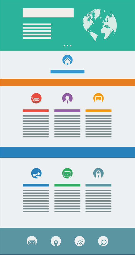
Landing pages
A landing page is the site we reach after clicking on any banner or publicity ad. It works the same way as a link from one page to another.
The landing pages are fundamental tools that can have different applications, like promoting and selling a product or service, gathering data from a particular market or reinforcing a brand.
A good landing page, along with an attractive offer, placed in the correct site for the correct audience, can get you numerous sells in a short amount of time. They can be optimized for search engines if they are intended to be used permanently. Although, in case of an offer, it is always better to have them only for a limited time to attract more public.
There are three main types of landing pages, which are mentioned below with a brief description:
‘Microsite’
The page is part of a micro-site designed for a specific audience or purpose. Normally, they offer one invitation for the user to take action of some kind, whether it is to buy or give some information. Data shared on the site should lead to conversion. Micro-sites usually contain pages with support information so the user can make a well-informed decision about the subject in question. Some micro-sites request more information and others are destined to the expected action. The supporting information can be a detailed description of the product or service, comparisons against similar products or services, case studies and testimonials, among others.
‘Mainsite’
The page can be part of the main corporate site. These pages have the same navigation and format as the rest of the pages of the site. The specific landing page could be the home page or be buried somewhere in the accommodation of the pages of the site.
‘Stand-Alone’
Some pages are designed specifically for a marketing campaign and usually have very precise information related only to the offer or action that is expected to attract visitors. It is common that they only have one clear and concise invitation of action for the users, which can be reinforced with a pop-up window inviting the user to take the same action or a second one when closing the page without being converted.

The first step is to define the target market and its goal. Special attention must be paid to the following features regarding the design and content of the page:
It must meet the expectations generated by the page in which it was redirected from, whether it is an advertisement with an offer or simply information regarding a topic. If the user clicked on the link, it is because he was interested in what was being advertised and hopes to find more information.
It must be brief, because the user seeks to access the information quickly and easily. Also, who designs the page, seeks to have all the possible information available to the user in order to attract him to the brand or company.
The text should be strategically placed to attract readers. It should have highlights and spaces between phrases to separate ideas, avoiding run on sentences. Bold, Italic or underlined words or phrases are great for gaining reader’s attention.
The offer should be highlighted in the original banner and it should invite the user to become a consumer. For example, use a button that says: “buy now”. When collecting data, a form may be used; and, to communicate information, an option to “subscribe” for a regular news bulletin can be implemented.
The images or text that are placed must be carefully selected, as any additional visual information other than necessary, can distract and even confuse the potential customer.
Appropriate use should be made of visual and kinesthetic elements that help to reinforce the user’s intention to purchase, such as colors or videos on the subject or product being advertised.
The most important aspect of the landing pages is the statistic information they provide, because through Google Analytics or the statistics service of the hosting panel, you can check the number of visitors and the number of conversions (users who turn into consumers) that resulted from such visits.
The landing pages play a very strong role when looking for a greater involvement with users or readers. When a user agrees to register their email to receive periodic information that may be of interest, each letter and word contained in these emails is carefully selected. The reality is that their reaction towards the webpage is what made them visit and not the reaction to the emails themselves.
This is why it is fundamental that the content of the website is attractive and helpful to those who visit. Their visit might be due to a previous commitment to the site or they may be first-timers.


